VISUAL BRAND IDENTITY
CONCEPT
School Project
2025
Team:
Jenna Kuusimäki
Jesse Meritähti
Software:
Adobe Illustrator
Adobe Photoshop
Adobe InDesign
Adobe After Effects
Figma
PowerPoint
During Corporate Image Design course we were tasked with researching small owned cafés and designing a visual brand identity concept for one — including such vital elements as a logo, typography, a color palette and defining the imagery and graphics.
In collaboration with Jenna Kuusimäki, we decided on Café Ella located in Espoo, Finland. As a recently reowned small café, we felt as though the café does not have a consistent visual identity as it is limited to a logo and exterior signage, with room for improvement online.
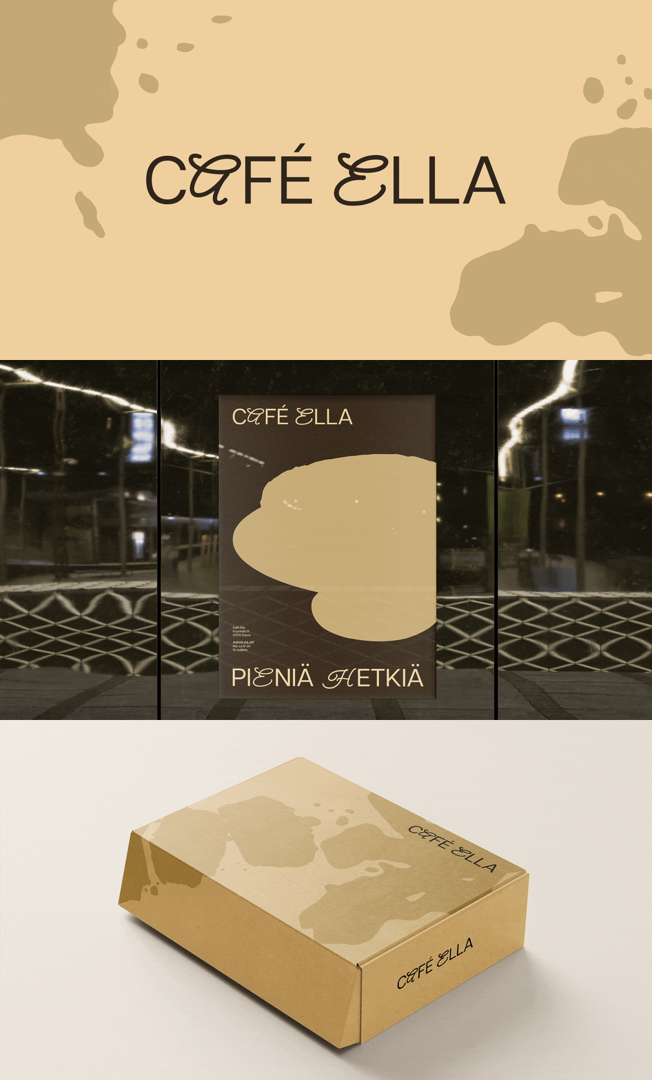
In addition to defining core elements, we also designed various assets to demonstrate the identity’s adaptability across different applications and a brand guide.
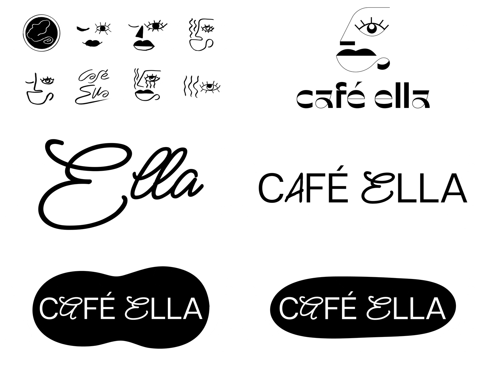
We began by redesigning the café’s logo — a script logotype, which in the past also featured a coffee cup logo mark. I wanted to aim for a look more personal, polished and timeless so I began by searching for inspiring typefaces that would match the desired qualities.
Having noticed an Ella Fitzgerald poster in the café, I experimented with a jazz-inspired female character mark but ultimately found the sketches ineffective and the need for a logo mark unnecessary. Thus I focused on typography, specially drawn to the sans serif Articulat CF (by Connary Fagen) and more stylistic Meow Script (by Robert Leuschke). I wanted to try combining these two extremes, adjusting the script’s weight to match Articulat CF. My early sketches included a coffee stain-like shape, but the idea was dropped early on as we decided to use the clean logotype as Café Ella’s logo.
There are two variations of the logotype based on the two primary brand colors, in addition to which in black and white prints a white or black variant can be used.
The design process for the color palette involved using AI color generator Huemint, which generates color palettes and and demonstrates them in various applications such as mockups. Our aim was to define two primary colors and one secondary color for graphic elements. Using the generator, we looked for and locked on colors we were pleased with, then further experimented and refined them in Adobe Illustrator with the Color Guide tool.
We liked a light, monochromatic palette but it posed challenges in terms of contrast and accessibility. Thus we chose a light and dark primary color, with a secondary color in between for graphics. We decided on the palette early on and it remained mostly unchanged, with slight adjustments as we converted the hex codes to Pantone colors and then redefined their RGB, CMYK and hex values more precisely. We also defined infographic colors — for use in pie charts or other visualized statistics — using Illustrator’s Color Guide tool and Pantone references.
I was responsible for typography, and having mutually decided on the logotype I designed, it was only natural to base the typography on it. Articulat CF Medium is used for body text, Articulat CF Demi Bold for highlights, and Bold for headlines. Articulat CF Medium Oblique is used for additional information in menus for example. For further typographic hierarchy, I also defined the relationships between different paragraph styles and line spacing.
Café Ella's slogan is simple yet meaningful, reminding us how life is made up of small but important moments. The main slogan "Small moments" can be adapted to various situations such as holidays in posters, social media posts and animated advertisements. The stylized presentation of the slogan is built using both the Articulat CF and Meow Script typefaces — Articulat CF Regular is used by default, while Meow Script appears in only two letters of the slogan to match the Café Ella logotype. The stylized version of the slogan is used exclusively in visual presentations where it can be displayed at the largest possible size — in materials where the slogan is not the focal point, it can be used in headlines and subheadings formatted accordingly.
To ensure functionality in Microsoft 365 programs, Tahoma and Arial Bold were chosen as alternatives.
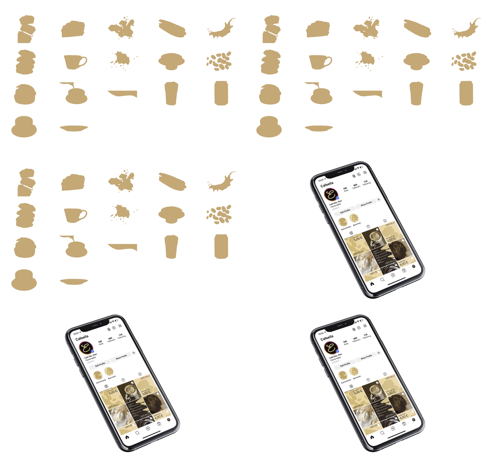
The graphic elements feature cut-out style illustrations, a concept we chose based on Jenna’s suggestion after seeing similar elements used on social media. I very much liked this approach as a fan of minimalist illustrations, and also having seen similar elements used successfully on product packaging for example. I found the approach potential with opportunities to apply it across various applications — in addition to which I found the choice also relatively bold and unique.
Jenna further defined use of illustrations and images in social media, focusing on carefully selected macro photographs featuring close ups of the café’s products such as hot beverages, baked goods and seasonal products. The goal is to highlight the high quality products in a cohesive manner with the overall visual identity.
To demonstrate the functionality of our concept, it had to be applied to various uses and applications.
In addition to the finished vector logo, I also created an animated version using After Effects. I decided to animate the logotype as if written by hand — the different stroke directions of the script and sans serif letters being a nice dynamic touch. At first the letters would appear one by one, but the animation felt too slow and awkward so they all appear simultaneously, making the animation much more engaging.
One of the more time-consuming tasks was designing a website prototype for desktop and mobile using Figma. Given that Café Ella does not have an existing website, we opted for a minimalistic one-page design featuring a short introduction on the café, a weekly lunch menu and a full café menu.
My other tasks included designing PowerPoint presentation templates, window decals and mockups for a t-shirt and a takeaway cup to name a few, while Jenna designed a superb takeaway box, a business card and A-stand posters among others.
Designing the visual identity concept was an interesting and rewarding project that went smoothly without major issues. The final result is cohesive, functional and professional.
Collaboration with Jenna was seamless as decisions on core elements — such as colors and graphics — were made unanimously without compromise. We divided our responsibilities and tasks based on both our skills and preferences, offering feedback when needed, and shared a clear understanding of how much effort to invest in the project, thus resulting in a great and positive atmosphere.


