MAGAZINE LAYOUT
School Project
2024
Software:
Adobe InDesign
Adobe Photoshop
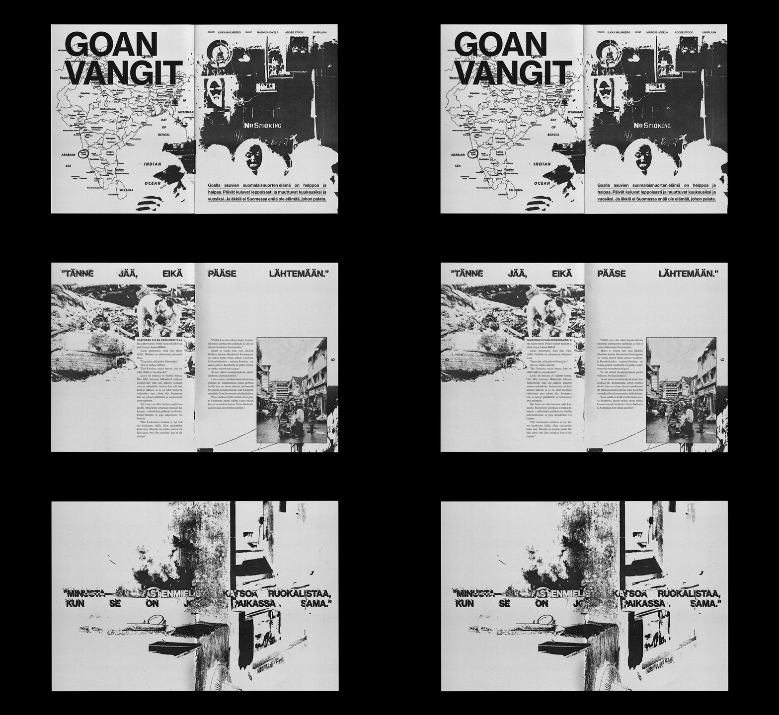
‘Goan vangit’ (eng. ‘Prisoners of Goa’) served as the final project on Publication Layout Design course. The article, written almost 20 years ago, describes Finnish individuals living in Goa, India while often portraying them as outcasts that rely on Finnish social security while enjoying their bohemian lifestyles on the other side of the globe.
Our assignment was to design a magazine layout for the article with complete creative freedom in typography, layout, imagery and style. Thus I chose early on to experiment with alternative visual styles I have been inspired by lately, rather than following a mainstream approach.
In my personal work you can often see influences of Swiss design in sans serif typefaces, grids, white space, and solid color surfaces. Over the past year, I've developed an interest in publications styled this way as well as Swiss grit and mixed media collages. Heavily inspired by these, I have begun experimenting with different techniques in constructing images and layouts — e.g. by using various textures and challenging the conventional design principles little by little.
After reading the text for a couple of times I began building a moodboard for myself that consisted of numerous publication layouts and mixed media collages etc. — by designers such as David Carson, Chris Ashworth and Mike McQuade to name a few — that I have come across social media platforms such as Instagram.
My aim was to create a rough impression through typefaces, imagery and textures. The article describes the living conditions of Goa as ascetic and I wanted the design to embody the rugged — maybe even hostile — conditions of Goa rather than creating an image of an exotic paradise.
In terms of typography, I used Tisa Pro for the body text and Neue Haas Grotesk Text Pro for everything else. I considered using only different weights of the latter for an even more Swiss-inspired look but eventually chose not to due to the article's length and sans serif typefaces being generally less legible in body text. In addition, using two typefaces not only created better typographic and visual hierarchy but also complemented the article's contrasting nature. As the text is placed in columns of various widths, I carefully refined and adjusted the word and letter spacings of the left justified text.
The most challenging aspect of the project was the imagery in which I decided to use images provided to us but also stock images. Early on I sensed uncertainty and constantly feeling like I could do better. My initial plan was to abandon the use of grid in composing the graphic elements, but found this just didn’t work for me. After spending considerable time on a few spreads I decided to start all over — the typography remained the same but I wanted to work in my usual grid-based method. I adopted a new approach: each spread featuring one or two dominant images, with additional images composed more freely — these were heavily edited in Photoshop and much more grunge (or noise) in style, which was accomplished by using various adjustment layers and effects. I also relied on various paper and photocopy textures to give a worn-out, scanned look.
Having tried this I felt like the pieces fell into place and I became much more effective and confident in my work. While some images are intentionally unclear without close examination, they complement the text by going hand in hand with it. Given the article's length and the possibly demanding nature of my design, I used white space and occasional spreads with only pull quotes and images to give the reader a break and add some rhythm. There are some sentences in the text that evoked strong and conflicting feelings and I wanted to highlight these by using them as provocative pull quotes that also act as graphic elements as they blend into the imagery.
Once I got into full swing, I found the design process very enjoyable and I feel like I succeeded in the goals I had set for myself. I tried to logically rhythm the text, but a few spreads towards the end seem a little crowded in hindsight. Overall the project has been one of my biggest so far with 15 spreads altogether but also some of the most fun I’ve had — once I decided not to think too much and just trust in my instinct, it all ended up happening very organically. That said I’m very satisfied with the end result, I would go as far as to say that it is some of my most intriguing work to date.


