VISUAL IDENTITY CONCEPT
Personal Project
2023
Software:
Adobe Photoshop
Adobe Illustator
Adobe InDesign
Adobe After Effects
Adobe XD
Hanto (反徒, eng. ‘rebels, insurgents’) is a Japanese style sushi and street food restaurant concept I came up with for a personal imaginary brand identity project of mine, in which I wanted to combine my interest in Japanese culture and love for food.
I have found that in Finland many Japanese style restaurants seem to have similar visual identities, so I wanted to create something different hence the name of the restaurant. Instead of conveying all things zen, I aimed for a bold, street-credible look that would appeal to younger (and young-minded) generations — something very urban and Instagram-worthy, but also laid back in attitude and high in quality.

Juxtaposing the streets and traditions, the brand identity features a bold, sharpie-inspired typeface both reckless and rebellious in attitude through its bold, hand-drawn appearance that I wanted to mimic the rough and unpolished look of graffiti and street art. The unapologetic typeface is used in headings whereas a more sophisticated and minimalist sans serif typeface is used in subheadings and body text for contrast and typographic hierarchy.

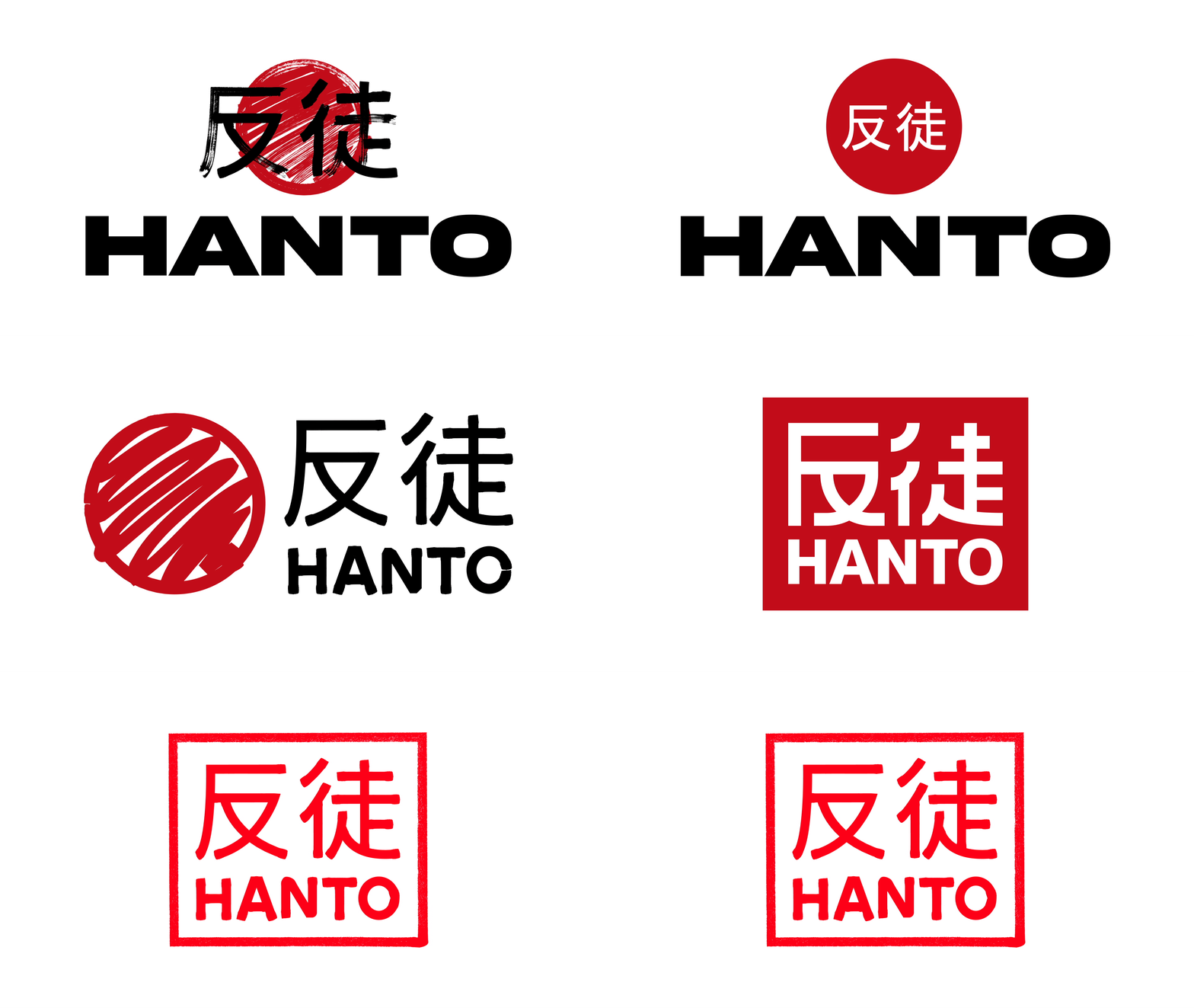
Early on I decided the logo of Hanto should go hand in hand with the striking typeface used in the headings, and began experimenting with various ideas that came to my mind.
None of these sketches seemed effective until I thought of making the logo resemble an inkan, a personal carved stamp used to authorize contracts in Japan — I found this consistent with my concept of forming the brand identity around the contrast of urban and tradition, thus proceeding with the idea. I then traced an earlier sketch with the pen tool, using a brush with rugged edges to link the logo with the heading typeface.

As I worked on the logo, I also worked simultaneously on concepts for a landing page and two posters. I feel like Japanese style restaurants often rely on illustrations and line art as a prominent graphical element so I decided to use carefully picked stock images instead. This was also a personal preference as I've focused a lot on doing vector art in the past years and didn't want to make any kind of illustrations for the project this time around.
I wanted the imagery to convey the traditional culture of Japan, therefore using images of samurai armor, a maiko and a maneki neko to name a few. I adjusted the saturation to black and white and increased the contrast of the images, in addition to which I used ripped paper textures and striking slogans with puns in order to create an intentional effect of the posters being vandalized. In hindsight I would adjust the sizes of the Hanto logo and QR code just a little bit smaller, as they are slightly too large for my personal liking.
In addition to designing concepts for a landing page and street posters, I also created various others to envision what the visual identity could look like in a number of contexts, including a tri-fold menu, a business card, a staff t-shirt and an Instagram story promoting a DJ night. Created in After Effects, I also designed a ten second advertisement, aiming for more contrast with various effects to give the footage an aged and slightly glitchy look — paired with modern electronic music (‘Tianmen Mountain’ by Wohkeret) I found on a license free website. In order to make the text and logo seem handwritten in real time, I had to animate each stroke of every letter manually.
Designing the visual brand identity concept for an imaginary restaurant was a purely personal project in which I wanted to challenge myself by coming up an identity that could be consistent across a number of different mediums and contexts. Throughout the process I used my skills in several tools — such as Adobe Photoshop, Illustrator, InDesign, XD and After Effects —, seamlessly transitioning between them in my workflow.
Reflecting on the concept, there are some aspects I would refine with my current expertise but overall I am very pleased with the overall outcome, especially given it was my first slightly larger project and completed in a relatively short time.