KULLERVO PALE ALE
School Project
2022
Software:
Adobe Illustator
Adobe Photoshop
Adobe InDesign
Käpylän Panimo is a brewery that operates within Helsinki Vocational College and Adult Institute.
During my studies of Media and Visual Expression, I got to design proposals for their Kullervo pale ale and logo for the brewery, both of which are renewed annually. Named after the character in Kalevala, a 19th-century epic poem compiled by Elias Lönnrot from Finnish oral folklore and mythology, I wanted the label to feel like a work of art, symbolizing his vengeful life through vivid strokes and use of colors.
The project marked my first time doing label and logo design, in addition to which I had little knowledge of different beer styles, let alone the brewing process itself.
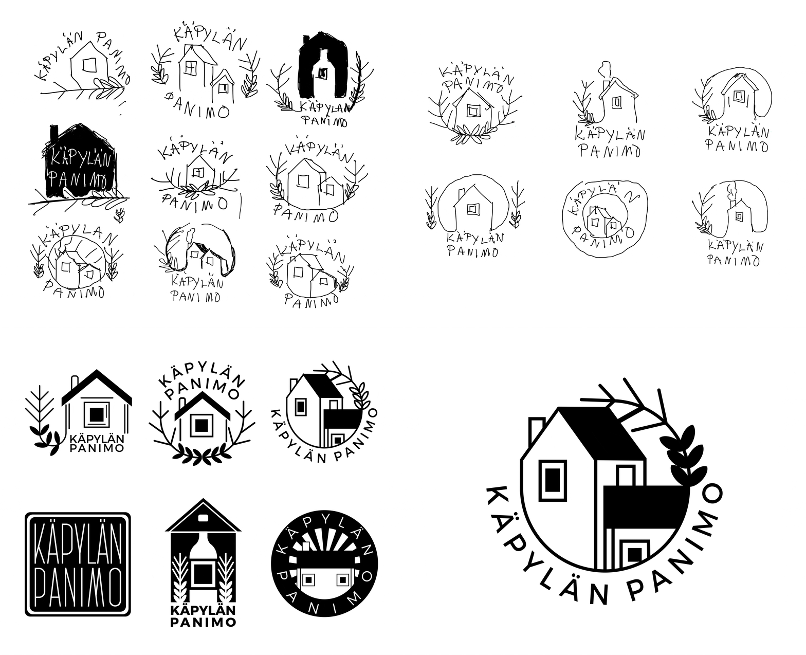
I started by benchmarking various brewery logos and label designs, creating a comprehensive moodboard from online sources and supermarket beer sections — which I now like to visit to admire the vast designs. Inspired by logo designer Will Paterson's advice that a quality logo should be drawable from memory within a minute, I made rough sketches on paper while drawing inspiration from the neighbourhood of Puu-Käpylä in Helsinki, known for its wooden and colorful buildings designed in the style of so-called Nordic Classicism. I then continued to refine the sketches in Adobe Illustrator, during which I made sure to consider scalability so that the logo would work in a smaller scale on the label.
The final logo was selected through multiple elimination rounds, with input from my beer-enthusiast friends who have a better knowledge of different brewery logos.
The design of the label itself developed more slowly as I wanted to challenge myself with something new. Having done a lot of vector graphics, I decided to try pixel graphics with a more expressive touch, drawing inspiration from abstract expressionism as I wanted the label to feel like a work of art.
I initially planned to paint the label in Adobe Fresco but ended up designing it in Adobe Photoshop instead, as my laptop of the time couldn’t run the former. Having less experience in digital painting than photo manipulation, I used the Art History brush to transform a rough concept sketch I had drawn, eventually achieving the painted and abstract look I had wanted through trial and error. The vivid colors contradict the harsh life of Kullervo, full of injustice and vengeance while symbolizing his anger and the fire in which he lost his whole kin.
To reflect Kullervo's harsh and violent life in the typography, I aimed for a heavy sans serif typeface with unapologetically sharp lines. I ultimately chose to use Atami Display Bold in the name of the product and Atami Regular in other text.
In addition to the logo and label designs, I also designed a table triangle to promote the product for which I created a physical prototype.
After a couple of years I still feel like I met my goals for the project which is one of my portfolio favorites. With my now improved skills, I would opt for a perhaps more minimalist approach in the logo design and fine-tune the typography of the label further. What stands out most to me is the vivid color scheme in the label design.
